s you may know, Project Lexa is a game primarily built around translating languages — a language of our own creation, in fact! And while we’re not going to reveal too much about our constructed language in this post, you might be wondering, “how exactly do you go about translating in this game?”
Great question!
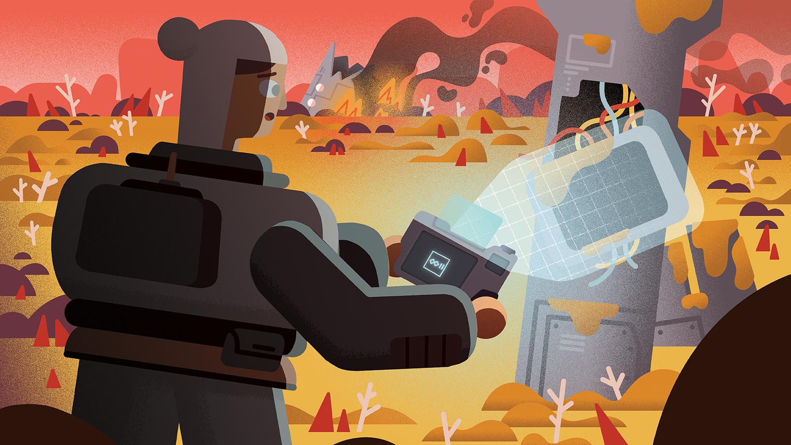
Playing as Lex, your main way of interfacing with the alien language in Project Lexa is via your handy, dandy tablet translator. Simply point it at any alien glyphs you see and — presto! The glyphs are scanned into your tablet for you to freely work out what they mean. And glyphs are hidden everywhere in Lexa: injected in terminals, hacked onto devices, and otherwise spread throughout the world.
And figuring out the presentation and interaction of translating these glyphs is an important user interface and experience problem for us to solve. It’s been an ongoing, iterative process to discover what works and what doesn’t when it comes to the translator, and as part of revealing more about Project Lexa, I wanted to share our findings so far!
Prototype Translator

A version of the translator from October 2020.
The initial version of the translator was experimental to say the least. Early in development, I planned on Lexa’s translator having three separate screens: one to show the current “page” of glyphs you were viewing, another to show the currently targeted glyph, and a third to show a list of previously submitted translations for the current glyph.
You can see those requirements already starting to materialize in this very rudimentary version of the translator, with the current glyph page represented by the white field of glyphs (minus any sort of frame or border, as I didn’t want to get too distracted by adding details that were likely to get ripped out), and the currently targeted glyph screen and previously submitted translations screen represented by the top and side screens of the L-shaped device, respectfully.
At this point, I was already in talks with Nick Nazzaro, our art director, to join the project, and I knew his sci-fi art went for a more retrofuturistic, Googie style design, so I tried to capture that with my very basic programmer art for the translator. I may have over done it, going too far in the direction of something like The Jetsons, since future iterations of the translator saw us conforming to a more traditional layout.
Version 1

A version of the translator from June 2022.
And here’s one such traditional layout!
We’re still dealing with my janky programmer art, but we’re slowly moving towards a layout closer to what we have in our current builds of Project Lexa. This version of the translator coincided with early versions of the core gameplay loop of exploring an environment and interacting with terminals that held alien glyphs — as good of a place to call “Version 1” as any.
But let’s talk more about the interaction design here. The way you determine what glyph you’re currently translating is with the on-screen reticle located on the bottom screen. When the reticle comes into contact with a glyph, that glyph then appears on the top screen for translation.
The interaction design for the lower screen in this iteration differed from later versions in several ways: first, the reticle here is fixed to the center of the screen, so the movement controls actually moved the underlying screen around as opposed to moving the reticle. You can see this in the above screenshot with how the rightmost button (depicted with a white border and red background) is partially cut off the screen as the reticle is centered on the leftmost button with the glyph in the middle. Second, we had the interaction prompts for the reticle encircling the reticle itself — depicted here with an X key prompt for interacting with the button and a Space key prompt for translating the glyph — instead of binding them to any sort of collected prompt tray at the bottom. Lastly, this version included zoom in and zoom out prompts — shown here as the magnifying lens icons bookending either side of the bottom screen. All three of these implementations would eventually be rearranged or otherwise removed when we discovered that they didn’t quite work with what we were trying to achieve with the translator UI.
Why did we choose this somewhat awkward layout and interactions for the translator? Why didn’t we just immediately go with more conventional designs used over and over in many games — such as all of the prompts aligned in a row on the bottom of the screen? One is a product of convenience. At this stage, we were more concerned with getting something semi-functional on the screen as opposed to making sure it was perfect. Polish can always come later. Two is that experimentation can always lead to new and unique discoveries. There are tried and true UI/UX design patterns for games, yes, but are they the best solution for every given interface challenge? Not necessarily. Give yourself permission to try out an alternative, and if it doesn’t work out, well, you can always fall back on the tried and true method.
And Introducing: Multiglyphs
You might also notice that the three glyphs in the top translation view screen don’t match the glyph currently being targeted by the reticle. That is not intentional design but instead me purposefully hijacking what glyphs the single glyph shows to debug and experiment with another aspect of our glyph language: multiglyphs.
The basic concept of multiglyphs is this: some words, instead of being represented by a single glyph, are made up of a combination of multiple glyphs. But each individual glyph inside a multiglyph still holds onto their individual meaning, so the word being represented by the multiglyph is actually a combination of the meanings of individual glyphs put together.
If that seems confusing: don’t worry! We’re working really hard to make sure the learning curve for the intricacies of the glyph language is as smooth as possible. I’m also purposely being a bit vague so as to not ruin any of the surprises we have in store!
Version 2

A version of the translator from March 2023.
The second version of the translator saw a huge leap in art quality. Gone is the programmer art made by yours truly, replaced with some real deal art from Nick.
In this version, you can see all of the UI adjustments I listed before: the reticle (now a small, blue dot as opposed to an unwieldy, purple, cockpit-style crosshair) now moves freely around the lower screen instead of being affixed to the center. The interaction prompts for the translator are now in a more traditional spot on the bottom of the screen (and are showing off our added support for Xbox controls with the X and A button prompts), and the zoom prompts have been removed completely.
Another addition you might notice in this screenshot is a traditional-looking D-pad in the upper lefthand corner with a Hide prompt next to it. This allows the player to partially hide the translator, temporarily sliding it out of view. When it’s hidden, the prompt then changes to a Show prompt. We’re still testing the usefulness of this feature, since most actions in the translator affect something in the world, I figured it would be useful to glance out of the translator without having to dismiss it completely. We’ll see if it sticks around!
The Keyboard View

Version 2 of the translator with the keyboard active.
Here’s another important aspect of the translator we’ve yet to show: the keyboard! Our keyboard is more stripped down than a traditional keyboard — smaller than even a 60%! — since we aren’t expecting the user to enter numerals or most special characters, though in later revisions of the keyboard, we did add in support for period, comma, and question mark keys.
We don’t even care too much about capitalization, opting instead for an all caps approach, so the Shift and Caps Lock buttons have been discarded. Standing in their place on the left side of the keyboard is a custom Cancel key, which allows the player to wipe away whatever translation they’re in the middle of entering. And alternatively, instead of a traditional Enter key, we instead have a Submit key, which acts as saving your current translation. Both Cancel and Submit are actions that dismiss the keyboard when you’ve selected them. And of course, we have a backspace key in its usual placement on keyboards. Because there are no letters entered in the current translation in the above screenshot, you can see that the Backspace key is currently a second Cancel key, letting you erase and back out of your current translation with one button.
You can also see that there are Xbox button prompts in this screenshot of the translator. That’s because our in-game keyboard also allows interaction solely via a controller if you so choose (we have full keyboard support too, don’t worry). So if you prefer to kick back and play your PC games with a controller, you’re free to do so! This gamepad support will also come in handy if we decide to bring Lexa to consoles one day…
Confidence Tags
You may have also noticed an additional UI element on the translator while the keyboard was active: a yellow tilde icon bookended by the shoulder button prompts. What’s that for?
Well, we want the translation gameplay in Project Lexa to be a process of trial and error, and we want the player to feel comfortable that they can enter one — or multiple! — translations for a glyph even if they’re unsure if they’re correct, as the translator is a repository for both complete and incomplete information.
But if you’re entering multiple translations for a glyph, then how do you indicate that you’re only somewhat sure about some of the translations you’re entering? Enter: confidence tags. Confidence tags allow players to mark their confidence in a given translation they’re entering. There are three types of tags a player can enter: correct, incorrect, and unsure. These confidence tags are entirely driven by the player; the game never “locks in” a correct or incorrect solution like you see in games like Return of the Obra Dinn or Chants of Sennaar — any translation is editable at any time throughout the game. It’s on you to use your powers of deduction to determine what translations are right and wrong.
Version 3

A version of the translator from August 2023.
The third version of the translator showed more incremental changes. The most obvious addition is the group of tabs seen at the top of the device, which extend its functionality. All of the screenshots up until this point have taken place in what is now the Translation tab, but we have two additional tabs: Memory and Map.
The memory tab will become increasingly vital as you progress through the game: it will be a repository for every terminal and every glyph you’ve come across so far in Project Lexa. You can reference this stored information at any point to help build knowledge and context as you further discover new aspects of the glyph language.
The map tab is more straightforward: it’s a map! It defaults to showing you a map of the current area, but we have plans to allow you to see every interactable that you’ve touched so far, acting as a second way to see the screens saved in the memory tab.
Missing in this version of the translation is an additional, fourth tab: the inventory. This screen also serves a pretty straightforward function: displaying all of the items you’ve picked up on your journey.
Version 4

A version of the translator from August 2024.
Let’s jump forward another twelve months to the fourth version of the translator.
With this iteration, Nick wanted to experiment with the color of the device, I also wanted to make some changes around the design. First, we have a new typeface for the UI — Fredoka. I wanted to get away from a stereotypically sci-fi font to something that could match Nick’s art style while also evoking the calm, sleek fonts you see in modern user interfaces. Additionally, we made the hide and show prompts appear more diegetic — the D-pad that controls the hide and show functionality now looks like it’s a part of the actual device.
You can also see the aforementioned inventory tab added to the tab bar at the top of the translator, but looking closely, you can also see that my janky programmer art tabs are actually sitting atop an actual tab bar that Nick rendered. In this iteration of the device, I hadn’t made the time to make the tabs seamlessly a part of the translator yet.
While each version of the translator continues to look a bit more refined than the last, there’s one major gripe I had with this iteration: it’s too flat. While most of the game’s art is rendered in a flat, 2D style, a UI component that encompasses the whole screen like this just begs for more detail. I think of those close up shots in cartoons like Ren and Stimpy or SpongeBob SquarePants where everything is hyperrealized in extreme detail (though those examples usually focus on gross details) and wanted something similar here.
I asked Nick if we could revert that aspect and he kindly obliged.
Version 5

A version of the translator from December 2024.
The fifth iteration sees that reversion in effect: the translator design is less flat, with curves and shadows returning to the device, and the translator’s colors have switched from those off-white greens and grays back to a purplish gray that we saw before.
This version continues to show off further refinement elsewhere: here we see fully-designed translator tabs in action. Each tab has three states — active, inactive, and disabled. The active state is what the translator tab is currently in, displaying the entirety of the tab’s name and its icon. The other three tabs are in the inactive state. They’re not currently targeted by the player but can be if they cycle through the tabs.
And while the disabled state isn’t visible here, I’m sure you can deduce what it can do: it’s reserved for tabs that you can’t navigate to due to some global state or condition. Currently, the disabled state is reserved for the translator tab whenever you open the translator when not interfacing with a terminal, device, or other screen or view that requires active translation. When the translator tab is disabled, you’re immediately navigated to the memory tab instead, since this tab will allow you to review previously inspected translations and screens.
The screenshot also shows off how this latest design looks when in mouse and keyboard mode. Here you can see all of the prompts on the bottom of the screen using keyboard keys, but the hide and show prompt also has switched from displaying a controller-style D-pad to a single diegetic button showing the current hide or show keyboard key. And at the top of the translator you can see more prompts bookending the translator tabs. These keys are what allow you to cycle through each of the tabs, which are currently mapped to the minus and equals keys.
Creating a complex piece of UI like Project Lexa’s translator is something that takes constant iteration. We’re discovering the needs of this device in tandem with designing puzzles and other aspects of the game. I have no doubts that we’ll iterate on the device at least a couple more times as we continue to zero in on our user interface requirements, and if we create enough new versions to justify a follow-up post, we’ll write one up!
And if you want to stay up to date on our development of Project Lexa, be sure to follow us on Bluesky, join us in our Discord, or sign up for our newsletter — where we share every new update as well as photos and videos of the game!
We’ll see you soon!


